In a recent scene, Jotun, revealed its much-anticipated CANVAS – the Global Colour Card for 2024. Designed as a comprehensive palette to inspire individuals, CANVAS showcases multiple carefully curated colors from Jotun’s extensive collection, including 10 brand new shades introduced this year.

Under the careful direction of Lisbeth Larsen, Jotun’s Global Colour Manager, and collaboration with Jotun’s color technology lab, the 2024 palette is a reflection of global trends and cultural nuances. Larsen believes that color is the most powerful tool for self-expression, emphasizing that everyone harbors an inner artist waiting to be unleashed.
“When it comes to expressing ourselves, color is the most powerful tool we have. Even if we don’t always realize it, all of us are brimming with ideas. Sometimes we just need to find the courage to express them. CANVAS is Jotun’s way of giving people that courage; of showing them that, deep down, everyone can be an artist.”, she said.

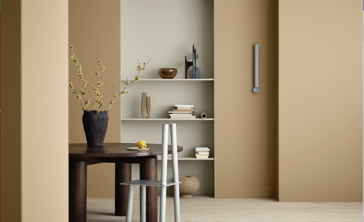
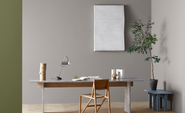
The CANVAS Global Colour Card doesn’t just include a selection of colors; it also includes a focus on emotions and moods that can be translated into a visual language. The palette also brings about feelings of serenity, rusticity, and reflection. Responding to the world’s growing inclination towards calming colors, Jotun introduces nature-inspired greens, fresh blues, soft greys, earthy browns, and uplifting yellows.

New Colors for 2024:
1. Mist (1376): A warm, greyish white.
2. Soothing Beige (12075): A muted beige tone.
3. Antwerp Beige (12290): A softly muted beige.
4. Soft Brown (12291): A golden muted brown.
5. Rock Sugar (1632): A golden brown tone.
6. Fahm (9925): A neutral cool grey.
7. Comfort Grey (12078): A softly muted grey.
8. Sheer Grey (12077): A light grey-beige tone.
9. Silver Moon (5081): A cool blueish-grey tone.
10. True Blue (4947): A fresh blue tone.
 Encouraging homeowners to freely unleash their creativity in selecting colors, Jotun’s 2024 Global Colour Card not only inspires but also provides useful insights into effective color combinations. Through vibrant interior photography, the card brings to life harmonious color families and complementary contrasts based on the timeless principles of color theory, which have guided artists and interior designers for centuries. It serves as a quick and informative guide for those seeking to express themselves through thoughtful and visually pleasing color choices.
The Global Colour Card a helpful guide to combining colors in a way that looks aesthetically pleasing. It includes a color-wheel graphic with insights on which colors go well together based on color theory.

Rana Khadra’s Expertise
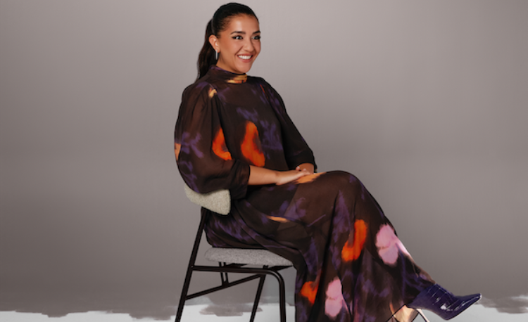
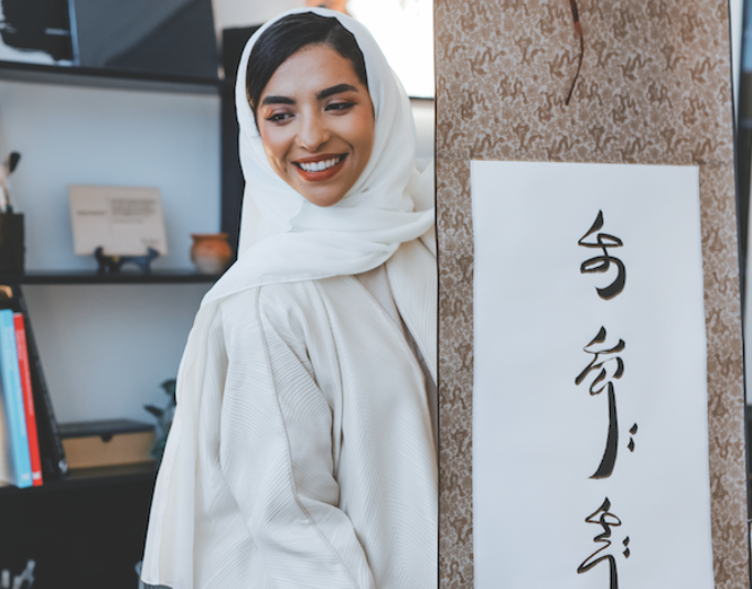
Rana Khadra, Head of the Creative Department at Jotun, shares her expertise in creating colors and spotting trends. As a certified Color Trainer and member of the Colour Marketing Group, Rana encourages people to explore the CANVAS color palette, turning their living spaces into vibrant expressions of individuality.
“This year’s launch is all about inspiring the artist within yourself; it’s about letting go and unleashing your creativity in a world of color that truly reflects who you are through visual expression. We hope our customers will feel inspired to explore the CANVAS color palette and have fun creating beautiful, personalized interiors in their homes!”, mentioned Rana Khadra.

Jotun’s CANVAS 2024 Global Colour Card is a definite chance to be creative, allowing individuals to express personal stories and feelings in their living spaces. Jotun definitely has a worldwide influence, encouraging everyone to show their artistic side and make their homes uniquely vibrant.
To learn more about Jotun, visit Jotun.com.


